Twin Maples
A branding project. All students were given the name, Twin Maples, with the assignment to create the brand—and story—behind it.
Twin Maples Branding
Concept Statement
Twin Maples is a Japanese industrial design company specializing in sustainable, functional furniture and modern homewares. The company began small, designing custom furniture systems for residential and commercial clients, manufacturing their products by hand. As the company took on more business, they saw an opportunity to experiment with sustainable design practices and integrate recycled materials into their client work. They opened several retail stores in Japan selling their products. Twin Maples established corporate connections looking for sources of recycled materials, with the hopes of mass-producing their products made with reclaimed wood and distressed fabrics. Today Twin Maples sees their products as a way of education, hoping to change the way companies and individuals think about reusing materials.
Sustainable, functional, modern, minimal, ergonomic, modest. Twin Maples products are crafted with all of these qualities in mind. The brand should be crafted with equal attention and care should be taken to maintain a consistent visual voice.


The Twin Maples logo is inspired by the three-dimensional forms and methodologies of the products we make, and crafted with the same principles in mind: acute attention to detail, economy of shape, clean lines, and modern form.


Color palette and image treatment.
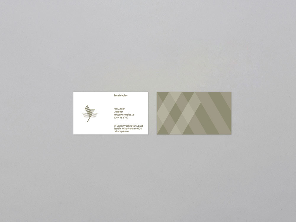
Business cards.

Corporate letterhead and envelope.
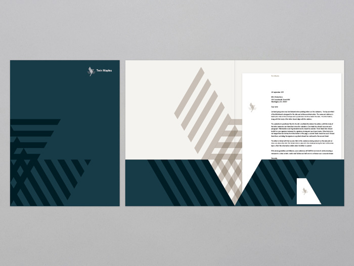
Pocket folder.
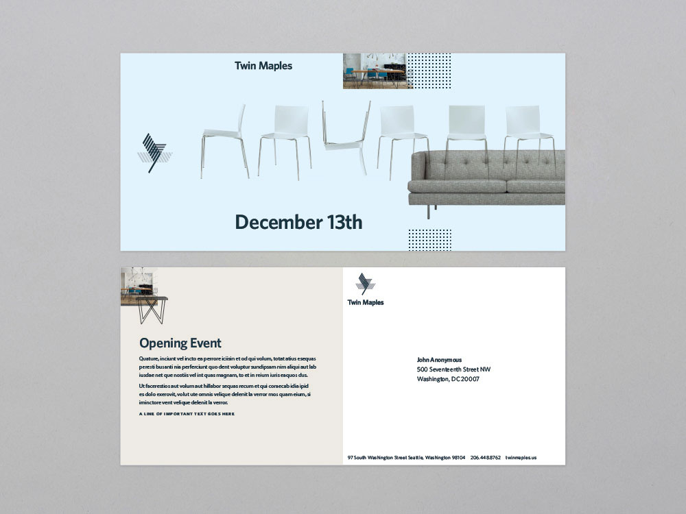
6in x 9in post card.